design explorations for my recipe app
covid struck once again and took me out for a few weeks. now i’m back with a few changes:
- the recipe editor works!
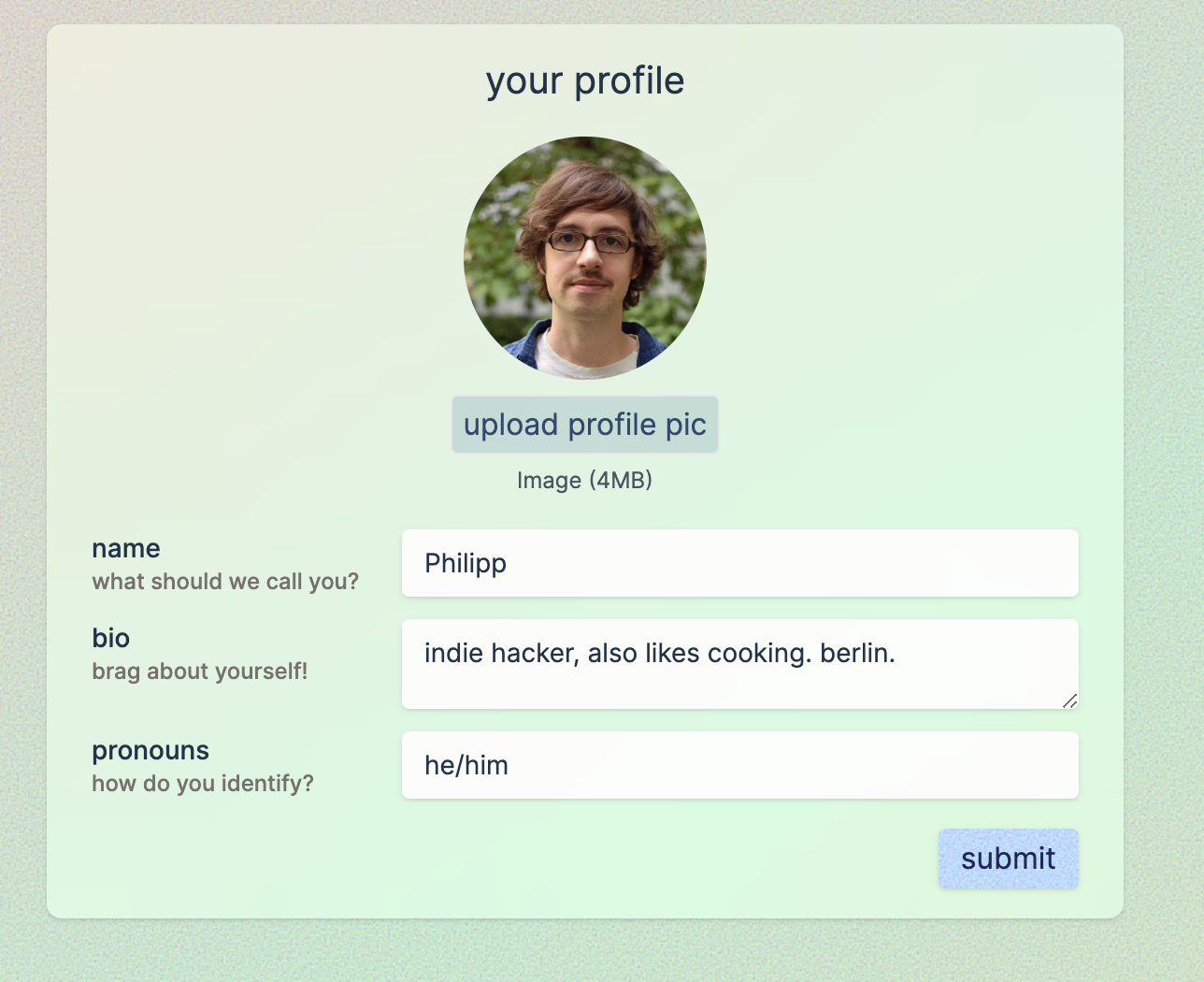
- there’s a new design, inspired by the arc browser - a light texture and a gradient, with glass-like accents, shadows and rounded edges.
the design challenge
i wanted a design that is easy on the eyes but also doesn’t look too boring. recipe apps have a tricky balance to strike - the food should be the star, but the interface still needs personality.
most recipe sites fall into two camps: either they’re cluttered with ads and popups, or they’re so minimal they feel lifeless. i wanted something in between.
inspiration from arc browser
the arc browser has this beautiful approach to ui design - subtle gradients, frosted glass effects, and generous whitespace. it feels modern without being cold.
i borrowed a few ideas:
- light texture: a subtle noise pattern that adds warmth
- gradient backgrounds: soft color transitions instead of flat colors
- glass-like cards: slightly transparent elements with blur effects
- rounded edges: everything feels soft and approachable
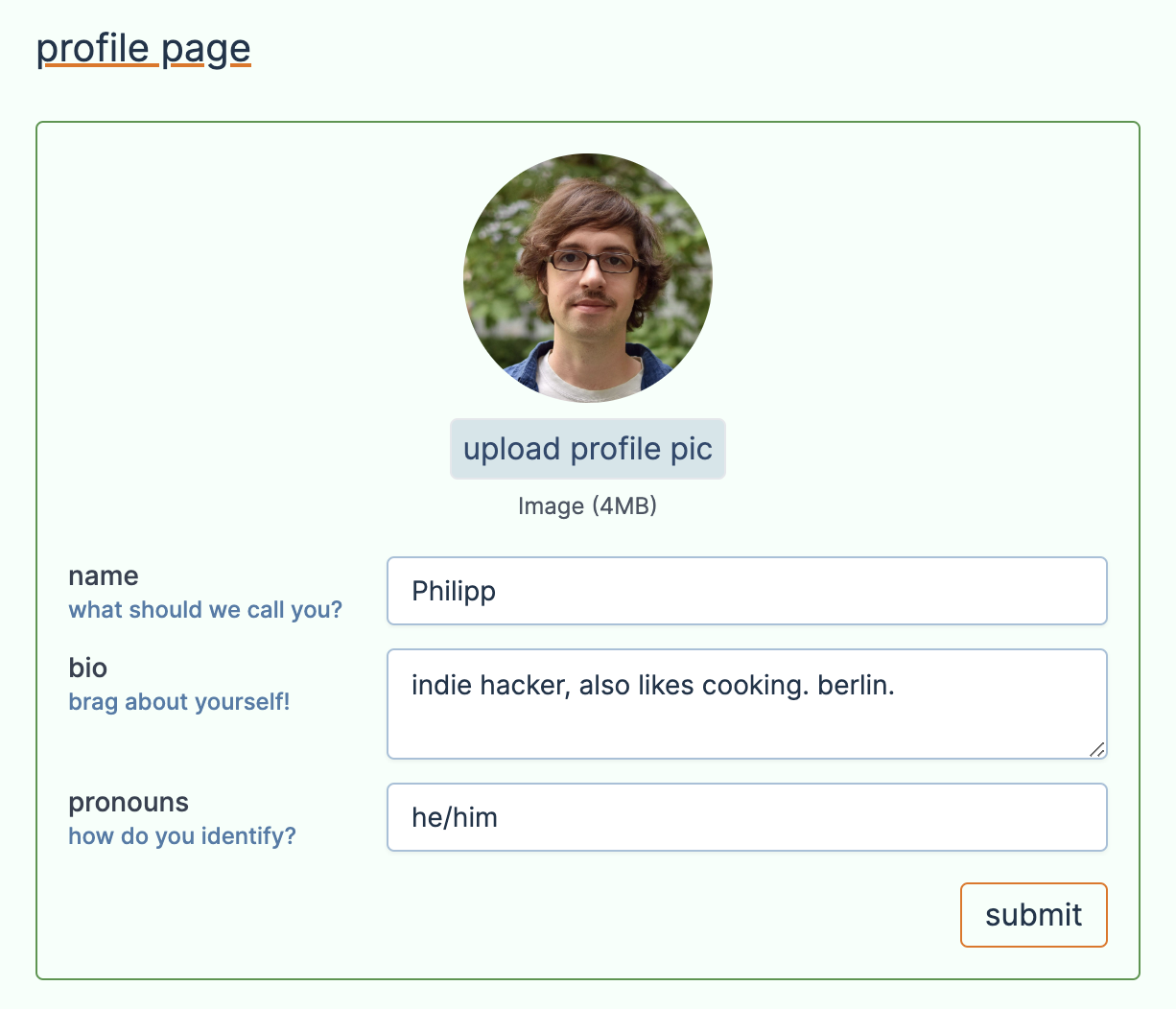
before and after
check out the before:
and the after:
what’s next
i’m not sure about the buttons yet - they might need more contrast. but overall i’m happy with where it’s going. the next step is to apply this design language consistently across all pages.
tomatovillage is one of my side projects. see what else i’m building.
got thoughts? i'd love to hear from you.
leave a comment